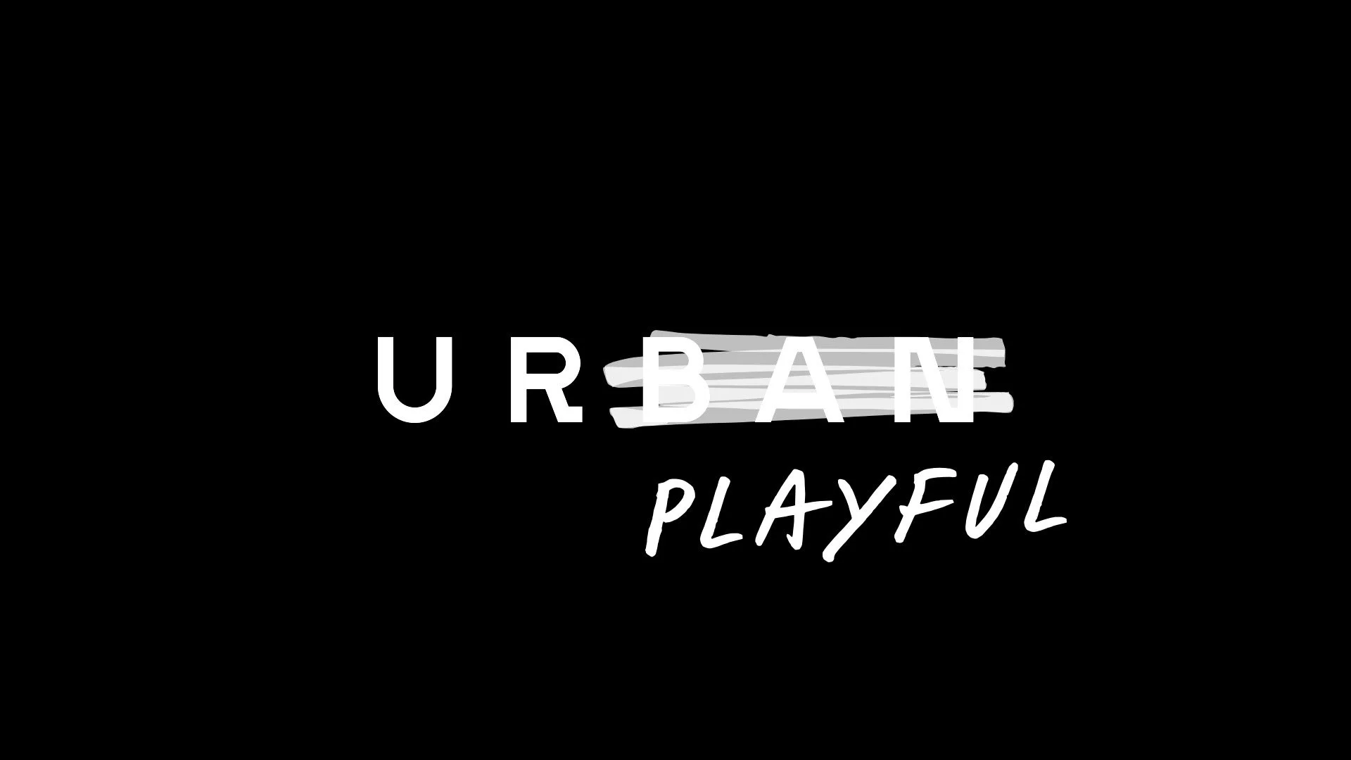
By accentuating the first two letters, U and R, in the name Urban, we created an efficient way to set the focal point on the individual — a way to communicate customer before brand. This is one of many devices developed in order to create a more dynamic profile able to function just as well on digital platforms as in the actual stores. One of these devices is a color profile which changes along with the seasons. Another one is an original typeface (created by Stefan Elmer), which overlaps existing text, and by doing so creates new coherences.
In total, Urban is left with a logo functioning as an active communication device, and a profile that communicates with its customers on all platforms – a complete adaptation to the digital development within retail.


